What does a box’s exterior say about what’s inside? And what does it say about you?
Don’t judge a book by its … wait. Looks can be deceiving … sure, okay. Or how about, I’ve seen worse? Yep, that’s the one.
I look at pedals all day long. And sometimes, if not most of the time, I kind of hate it. The days of seeing something unknown are nearly gone. For all of their glorious contributions to the progress (and distraction) of human development, I’m hard pressed to find a pedal on social media or eBay or an effects database (such as effectsdatabase.com, which I’ll admit is an incredibly helpful tool for finding cool stuff and losing hours of my life) that I haven’t seen—or feel like I’ve seen. It seems like a lot of the same and it’s hard for the new stuff to win.
Until I see something that pops, something that’s classic enough, weird enough, or strikingly correct and on point enough to get my attention. And that’s the goal. When making a pedal, I’m shooting for something that jumps out from the masses so someone will actually plug it in and give it a chance—something that represents us as a company and can represent the user as an artist, but can also trigger a fun collaborative process with a visual artist that has nothing to do with pedals. Maybe by talking this out, I’ll start to like pedals again. Stay with me.
I’ve enjoyed the fanciful, artistic, and thought-provoking look of some pedals, as well as the utilitarian, no frills, no bullshit, “here’s the pedal, here are the controls, here is what it does” approach. The look of a pedal communicates a vibe for both the company and the player. And at the end of the day, I want our pedals to look good. And if I’m using a pedalboard, I want it to look good, too.
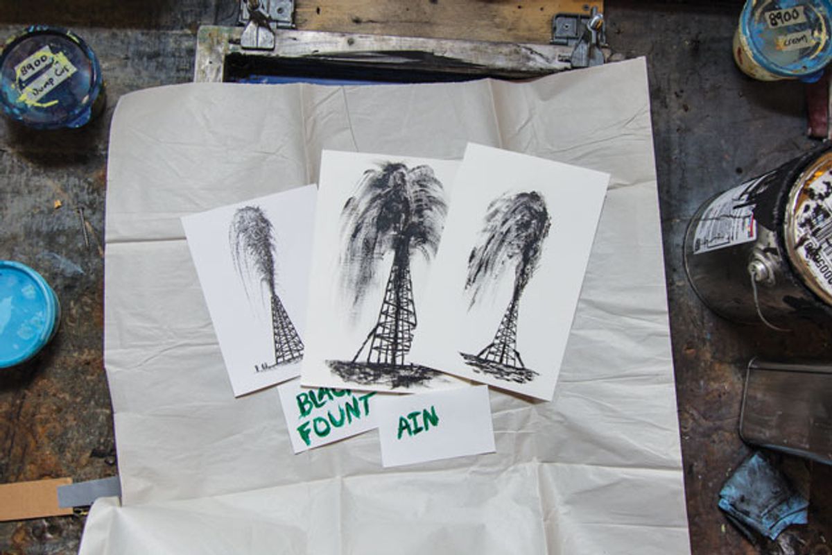
Let’s jump into the process for Old Blood Noise Endeavors. We start by considering the type of pedal and the vibe of the effect and how we would use it. So reverb, for example, is going to be spacey, open, mysterious, ominous. Then we try to select an artist that fits the mood—someone who can speak within the range of what we already feel, but can also operate on limited direction from us. Sam Larson’s Black Fountain delay artwork created a tone for our entire company.
and the player.
Daniel Danger, a longtime vintage pedal collector and amazing poster designer, stepped in to capture the brooding nature of the Haunt fuzz pedal. And each collaboration leads to the next: Garrett Young and the Procession reverb, Derek Nobbs and the Reflector chorus, and our latest, Jon Carling and the Dark Star pad reverb. These collaborations have allowed us to connect art lovers and music makers. Such projects let us share these artists with people we know and these artists share us with people they know. That whole cross-networking thing.
Old Blood is just one example. Fuzzrocious Pedals often feature custom hand-painted designs by the creators’ children. At Dr. Scientist, Mrs. Dr. Scientist—Tanya Clarke—handles the art direction for their pedals. Much of the artwork for Walrus Audio in the early days was done by Nathan Price, drummer in the band Broncho.
That’s just one side of it, though. What was common for me when I started using pedals was the utilitarian aesthetic—graphics based on information and ergonomic design for the easiest use. Have you ever missed a Boss pedal when trying to step on it? Never. And were the controls anything but clear and concise? Always in the same place, always using the same terminology. Understandable and predictable. And colorful. Which is brilliant. Your average pedal-user can make out the shape and color of a Boss pedal from the back of a room. “Oh, it’s green so it might be the Tremolo. No, wait, it’s a Phaser. Phew.” It’s classic, identifiable, and dependable. A respectable look and a respectable sound.
And for some of the players—the people actually buying the pedals—their decisions are based on who they want to be: on what their pedals say about them. To some people, the colors and the artwork can sometimes outweigh the actual sounds. I don’t know if that’s a good thing, or if it’s okay, or if there’s anything to be done about it. Seems subjective, just like the music itself.
I asked some friends how artwork plays into their pedal selection. An extremely pragmatic and reasonable guy named Dan summed it up: “The best art is at first striking (‘I’d like to play that!’), then helpful (‘How does it work?’), and then, over time, familiar and iconic (‘I love to see this old friend on my board, and my audience loves to recognize it’).” And at the end of the day, that’s it. You like what you like. Whether it’s literal, illustrative, and gaudy, or simple, instructional, and practical, there’s a place for it all on one board. So go with it.


