

I go to a lot of guitar shows.
Some of the guitars I see have
that certain something (some
don’t) and are visually appealing
enough for me to approach and
take a closer look. You’ve probably
had the same experience, but
what is it all about?
Well, it involves a package
of visual impressions that my
eyes seem to take in all at once.
Though I believe most people are
capable of taking in the same particular
package of visual impressions
all at once, they may not be
consciously aware if they have not
yet learned to pay attention. The
package includes the proportions,
lines, smoothness or lumpiness of
the curves, harmony of color and
texture, and the overall pleasingness.
It’s no different from the
capacity for instant assessment
of yummy-ness (or lack of it)
that a man might make when he
looks at a woman (or vice versa),
or even a car or motorcycle.
However, the sexual/sensual part
of an assessment is usually less
prominent when one looks at a
guitar or the average painting.
That desexualized version of one’s
personal assessment—fully valid
in its own right—is what we call
aesthetic appreciation, sense of
appeal, or “the right look.” And
as far as we know, we are the only
species capable of having such
an experience.
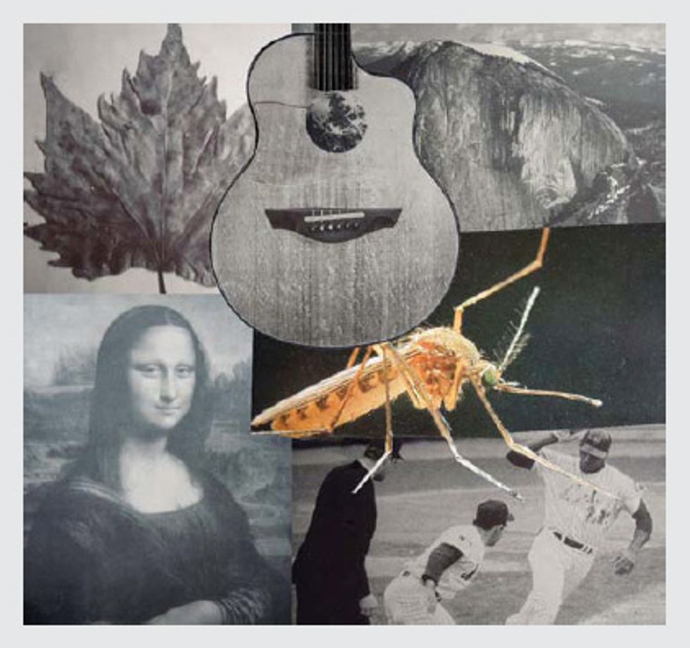
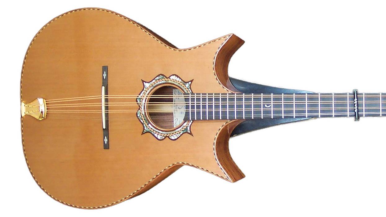
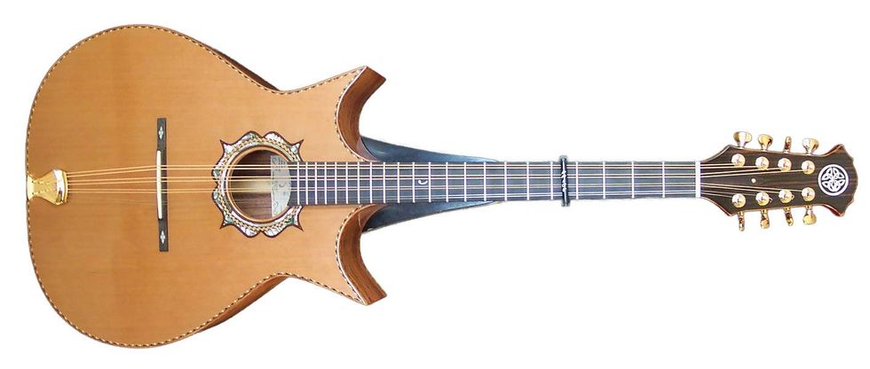
Take a good look at these six images. From the standpoint of design (in the simplest and most basic sense of the word), which image does not belong with the others? In other words, as design projects, which of these images looks right and which one does not? When making your selection, be sure to disregard size, cost, age, whether it’s exotic or common, familiar or unfamiliar, alive or dead, color, material (e.g., animal, vegetable, mineral, or synthetic), location, practical utility, caloric content, or social/cultural relevance. These things are all irrelevant to design essentials. We’re merely looking for a basic feature or element of design that all but one of these images share. Take your time, look carefully, and try not to read my answer until you have one of your own. I’ll give you my answer at the end of this column, and it’s entirely possible you may come up with a different one.
When considering things, sizing them up, and making judgments, nature has basically given us two distinct ways of arriving at a truth. One way is to measure, calculate, or compare against a standard, or figure something out and arrive at the “correct” answer. One can also intuit a truth or have an insight about it, by knowing something without being able to explain how one knows it. Intuition has nothing to do with measuring, calculating, or comparing—there’s something more direct, personal, and immediate about it. And while both methods are fully valid, neither one can be used to comprehend or explain the other. It’s like engineering versus art. How can either one be wrong?
In the world of visual art and design (we’ll get back to guitars in just a second), the main visual point is to arrive at the internal cues that signal “that’s it, it’s right, it’s done, you can stop now.” The striving can of course be modified by training and experience, but the artist stops only when he knows it’s time to stop. Short of that, he keeps on working, expressing, and seeking. Likewise, the viewer knows when something grabs his attention fully, or doesn’t. There is otherwise no calculation, clock, statistic, rule book, syllabus, recipe amount, blueprint, or deadline to otherwise tell either the artist or viewer that he or she has reached an optimal point. The technician, on the other hand, uses precisely these tools by following a different brain-map and a linear set of “performance instructions.” He stops only when he has met the explicit requirements of his task.
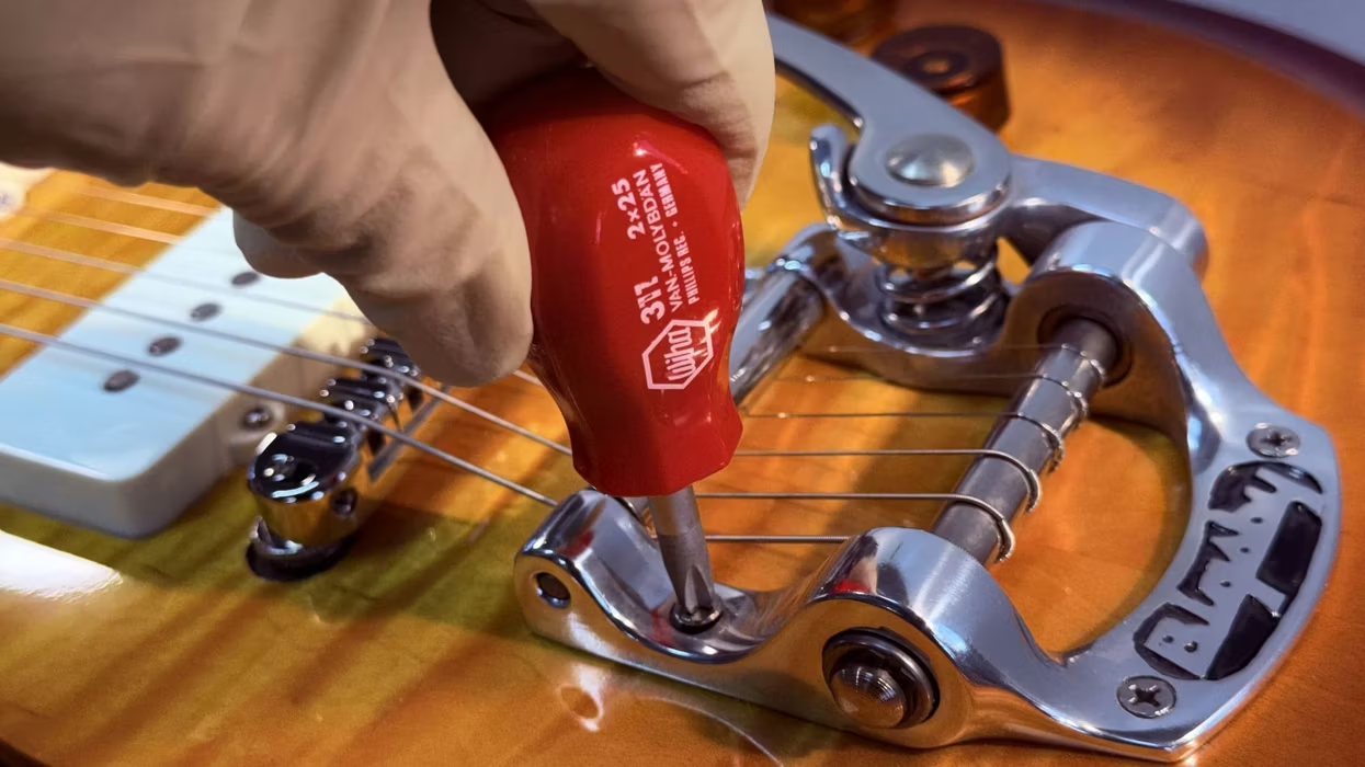
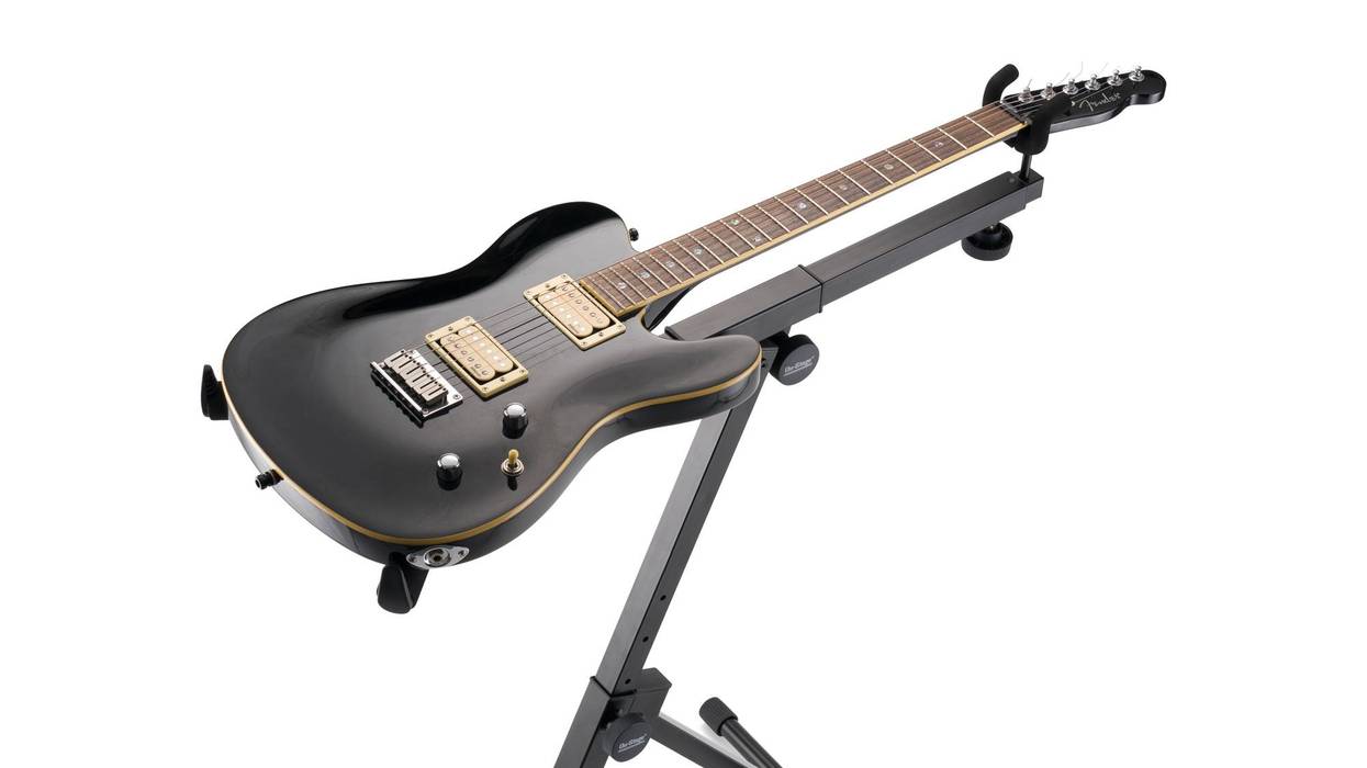
This brings me back to the many guitars I see both at guitar shows and in stores. Some of them look right to me, and some of them really don’t. The package of visual impressions includes the proportions of the body-width to the length, the smoothness or lumpiness of the curves as they morph into one another, the harmony and contrast of color in the woods, metal, or plastic, and the size of the peghead and bridge as part of the overall look. It all makes for an overall allure that enriches one’s experience of a guitar that’s made well. And that’s what you react to differentially when you see it, because different guitars literally carry different amounts of it. Their makers put those things in there … or didn’t.
Let’s get back to the images mentioned at the beginning of this article. My aesthetic take on this is that the guitar does not belong. Why? Because none of its lines or line values are found in nature. It seems to be created with a compass and a straightedge by someone who decided that this is a proper or desirable look. It has all the necessary parts, yet it somehow looks stiff, artificial, and lacking in organic naturalness, flow, or harmony. The Mona Lisa, the guitar, and the baseball players are all man-made images, but the Mona Lisa and the baseball players don’t strike the eye as artificial. Do you agree? I’m not saying artificial is bad—I’m just saying it’s different. There’s successful artificial and clumsy artificial. As we can see from this small sampling of images, some man-made quality works artistically and some of it doesn’t. As a matter of fact, the entire design industry—from clothing and cars to toasters and architecture—is about producing man-made shapes that appeal. But that’s a topic for a separate and longer article. The allure of a guitar, or lack of it, isn’t accidental. Someone either put it in there, or forgot to.
 Ervin Somogyi
A professional luthier since the early 1970s, Ervin Somogyi is one of the world’s most respected acoustic-guitar builders and rosette designers. To learn more about Somogyi, his instruments, or his rosette and inlay artwork, visit esomogyi.com.